

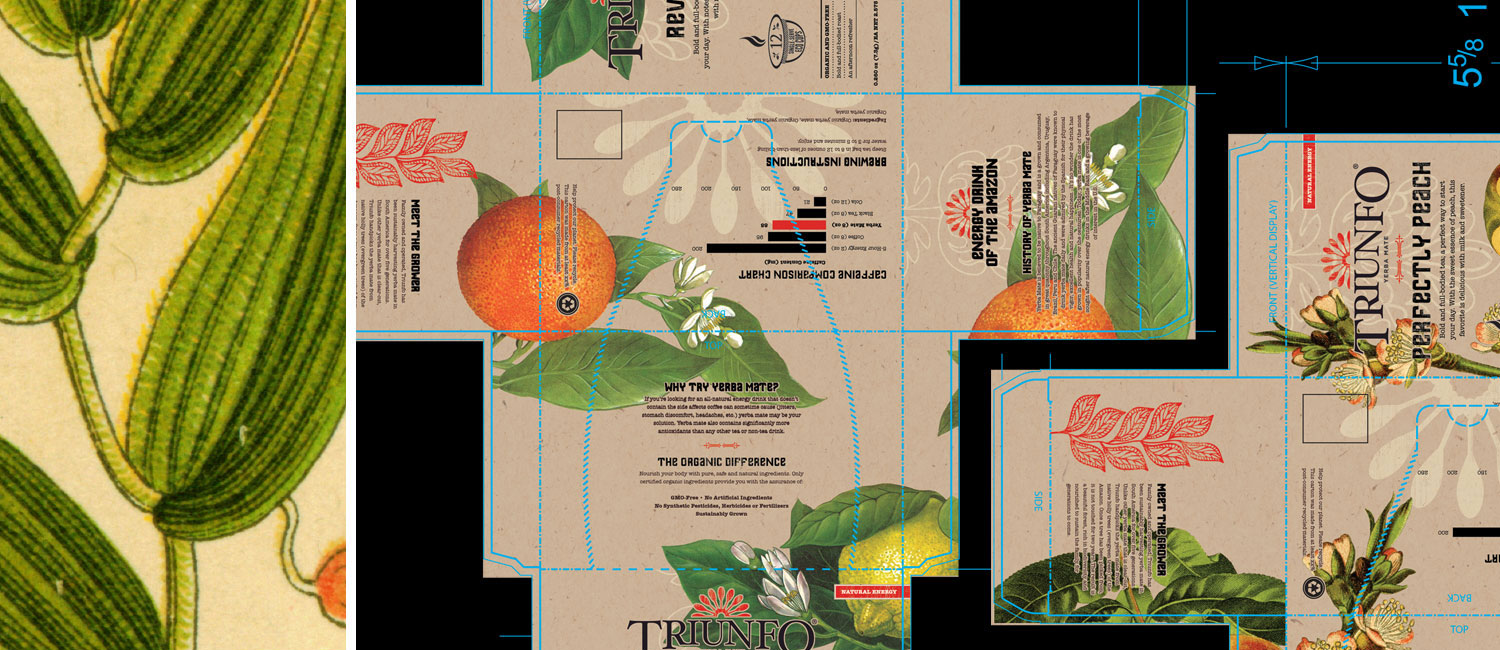
A PACKAGING REVITALIZATION
Triunfo is a line of Yerba Mate teas whose brand originated in South America. With an interest bringing Triunfo to the United States, we were approached by the company’s founders to revitalize their existing packaging to appeal to the American mainstream.
We worked with the client to update the logo and develop packaging designs that communicated the history and significance of Yerba Mate in South American culture, the benefits of drinking Yerba Mate versus coffee and differentiated the product from other Yerba Mate teas on the shelves.
GRAPHICS
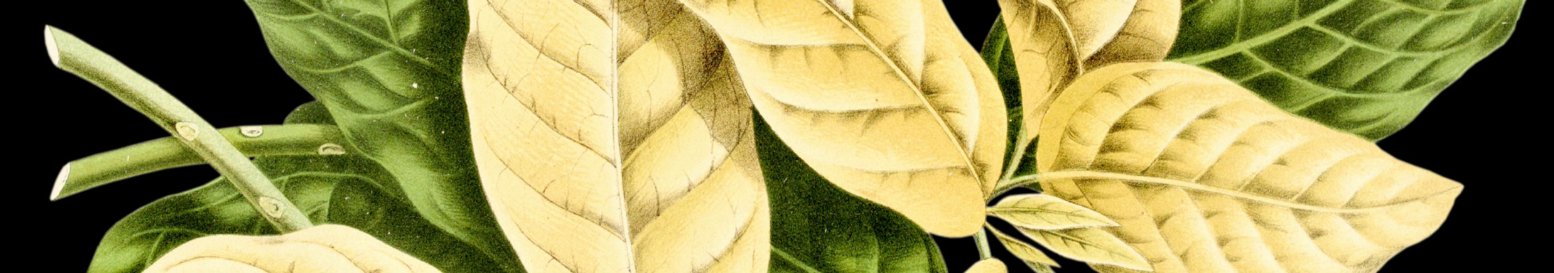
Eye-catching, illustrated graphics were paired with highly stylized typography that aligned with the cultural significance of Yerba Mate tea and modernized the prior visuals for the Triunfo line. A caffeine chart, commonly seen on coffee packaging, educated consumers on caffeine levels while likening the product to coffee. Recycled stock was chosen to reflect Triunfo’s organically certified ingredients.


Have a project you’d like to discuss? Want to ask a question or two? Feel free to shoot us an email or give us a call. We’re always excited by the prospect of mutually beneficial relationshps and helping businesses grow.