THE CLIENT
High Quality Organics is a grower, manufacturer and distributor of organic herbs, botanicals, spices and spice blends headquartered in Reno, Nevada.
THE CHALLENGE
When HQO approached us they felt that their outdated and inconsistent branding was causing confusion in the marketplace, did not reflect their forward-thinking ideas or operations and ultimately did not communicate the right message to their target audience.

VISUAL STANDARDS
We began the process of redesign by developing a clear set of visual standards based on the organization’s core values and brand personality. The brand guidelines clearly define logo usage and variations; typography and a color palette that reflect HQO’s values and personality ensure that all collateral is presented in a consistent manner that is aligned with the brand voice.

UI DESIGN
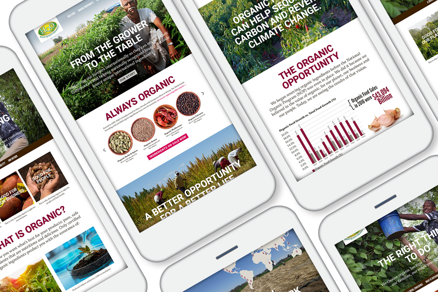
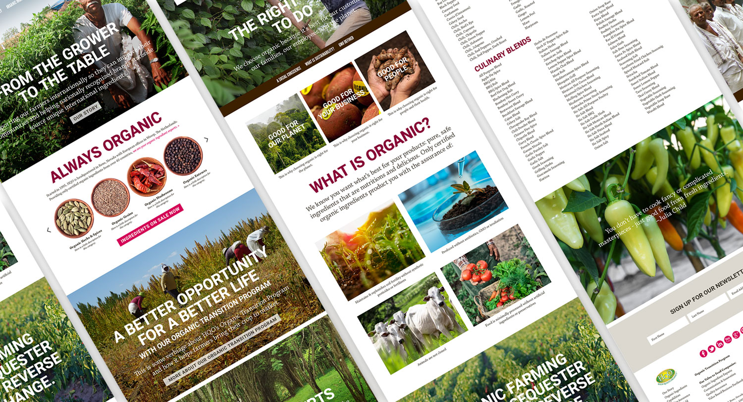
With a cohesive brand standards guide in place, we began the process of redesigning the website. Bright, high-impact graphics communicate the friendly, authentic personality of the company; real photos of suppliers communicate HQO’s commitment to Fair Trade and its growers.


Have a project you’d like to discuss? Want to ask a question or two? Feel free to shoot us an email or give us a call. We’re always excited by the prospect of mutually beneficial relationshps and helping businesses grow.